|
Questions? E-mail us
or call us 302-584-1771, 8AM to 10PM U.S. East Coast Time 7 days a week
|
|
Box and Whisker Plot Creator
An add-in product for Microsoft Excel
|
Screen shots: 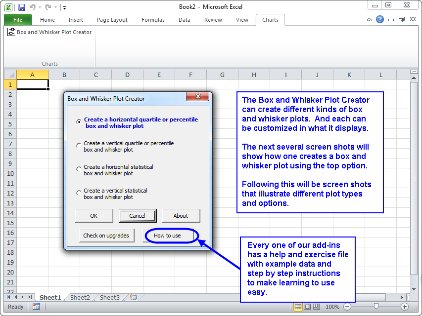 |
The Box and Whisker Plot Creator add-in for Microsoft Excel makes it easy to create box and whisker plots. It is compatible with Microsoft Excel 2010-2021 and Office 365.
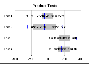
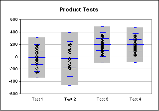
The following illustrates such charts created by the Box and Whisker Plot Creator. The charts may be horizontal or vertical:
Quartile box and whisker plot |
Statistical box and whisker plot |
|
 |
 |
The first box and whisker plot above is a quartile plot The gray area is where one expects 50% of the points to be. The points outside of the gray to the left represents the first quartile, or 25% of the points. The points outside and to the right represents the remaining 25%. The center blue bar is the median. The average is plotted as a white diamond. The smaller blue bars are the 1.5 sigma points.
The second box and whisker plot is a statistical plot. The gray area in this case is the 3 sigma range. One can set the range to be 1, 2, or 3 sigma. The center blue bar in the second box and whisker plot is the average (as it is a statistical plot). The three smaller sets of blue bars represent the 1, 2, and 3 sigma points.
On both plots one can:
- hide or show all the data points
- hide or show the sigma bars
- Show only outlier data points (those outside a 1.5 sigma range)
One can also create a percentile box and whisker plot. This is like the quartile box and whisker plot, except one can set the percentile for the gray area from 0% to 100%. So, if one wanted to show where 90% of the points appear, one would use this versus the quartile style box and whisker plot.
With the Box and Whisker Plot Creator, one can::
- create quartile, percentile or statistical box and whisker plots
- select multiple ranges of data from different worksheets and workbooks for the same box and whisker plot
- hide or show all data points or show outliers only
- set whiskers for the data range or for a 1.5 sigma range
- show 1 sigma to 3 sigma bars (or none) on the statistical box and whisker plot.
|
Order online from our secure service. |
|
US $29.95 |
Customers who viewed the Box and Whisker Plot Creator also viewed:
- Bubble Chart Creator - Quickly and easily create bubble charts from data tables
- Cascade Chart Creator - Create cascade charts that help you explain your data.
- Sensitivity Chart Creator - Easily create sensitivity or tornado charts.
- Waterfall Chart Creator - Create charts that compare quantity or volume to unit rates such as price/unit or profit per unit.
| Copyright 2024 Add-ins.com LLC, all rights reserved. Spreadsheet Assistant is a registered trademark of Add-ins.com LLC. |