|
Questions? E-mail us
or call us 302-584-1771, 8AM to 10PM U.S. East Coast Time 7 days a week
|
|
Waterfall
Chart Creator
|
Screen shots: 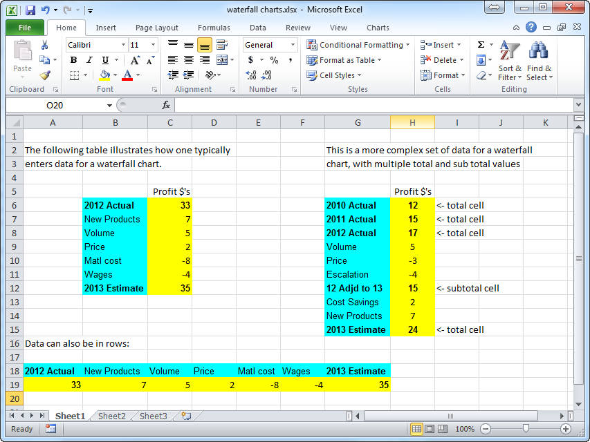 |
The Waterfall Chart Creator add-in for Microsoft Excel allows you to create waterfall charts. It is compatible with Microsoft Excel 2010-2021 and Office 365. The Waterfall Chart Creator is totally menu driven.
The following are examples of waterfall charts:
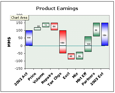 |
Click to enlarge the following waterfall chart images: ) ) )
|
|
On a waterfall chart the height of the red and green boxes represents the amount of change due to an explanation which is listed below the box on the X axis. The value of the boxes can be shown in the middle, at the top, or at the bottom of the box. Such charts are an excellent way to explain change. More information on waterfall charts.
With either approach you can plot as many data points as you want. And you can delete points if you don't need them. You can have multiple total values in a chart not just totals at the end points. And if you do not plot the totals you can create a brickyard style waterfall chart like the last example above.
Click on the following thumbnails to see the Waterfall Chart Creator's formatting and other options menus. These menus allow you to specify colors, solid or gradient fill, show values and position, and many other options:
) |
) |
) |
) |
You may send waterfall charts you create with the Waterfall Chart Creator to others. They do not need the Waterfall Chart Creator add-in to view the charts.
The following are a list of just some of the features:
- Connect totals and explanation blocks with horizontal lines between blocks, or lines that go value to value.
- Use solid colors, one color gradient, or two color gradient fills
- Use any pattern for files
- Create multiple waterfall charts at one time
- Update multiple waterfall charts at one time
- Hide or show any part of the axes or the chart
- Change multiple waterfall charts at one time
- Choose any color for total columns and waterfall values
- Easily update and modify charts
- Select any destination for new charts
- Easily display values on the chart - top bottom or middle locations
- Total columns in between start and end values can have different formatting than the start and end columns
- Specify a Y axis minimum to eliminate charts with tall columns and small waterfall values.
- Save up to 10 chart settings
- Customize the default chart setting and colors for new charts
- Create "brickyard" charts like the last example on the right
- Insert gaps between values
- Show multiple waterfall plots on one graph
If you want to try a copy before purchasing, download a trial version now!
|
Order online from our secure service. |
|
US $29.95 |
Customers who viewed the Waterfall Chart Creator also viewed:
- Bubble Chart Creator - Quickly and easily create bubble charts from data tables
- Mekko Chart Creator - Create charts that show three dimensions of data
- Sensitivity Chart Creator - Easily create sensitivity or tornado charts.
- Cascade Chart Creator - Create charts that compare quantity or volume to unit rates such as price/unit or profit per unit.
| Copyright 2024 Add-ins.com LLC, all rights reserved. Spreadsheet Assistant is a registered trademark of Add-ins.com LLC. |